Brand & Packaging · Wellness beverage
Go Grin
A kombucha and fermented-wellness brand, est. 2020: "Nature's Always Right." One pine, five flavours and a complete commercial system: identity, packaging, café presence, retail display, delivery experience and digital storefront.
Kombucha reads as an acquired taste, a health fad in a crowded chiller.
A warm, natural brand world: identity, five-flavour packaging system and every surface from café table to inbox.
From a fermented drink to a daily wellness ritual.
The brand thought
Wellness brands usually argue with science. Go Grin persuades with warmth: a pine that promises nature, a palette that tastes like the flavour it carries, and a voice that says relax, refresh, revive.
Your daily dose of health: kombucha as an everyday ritual, not an experiment.
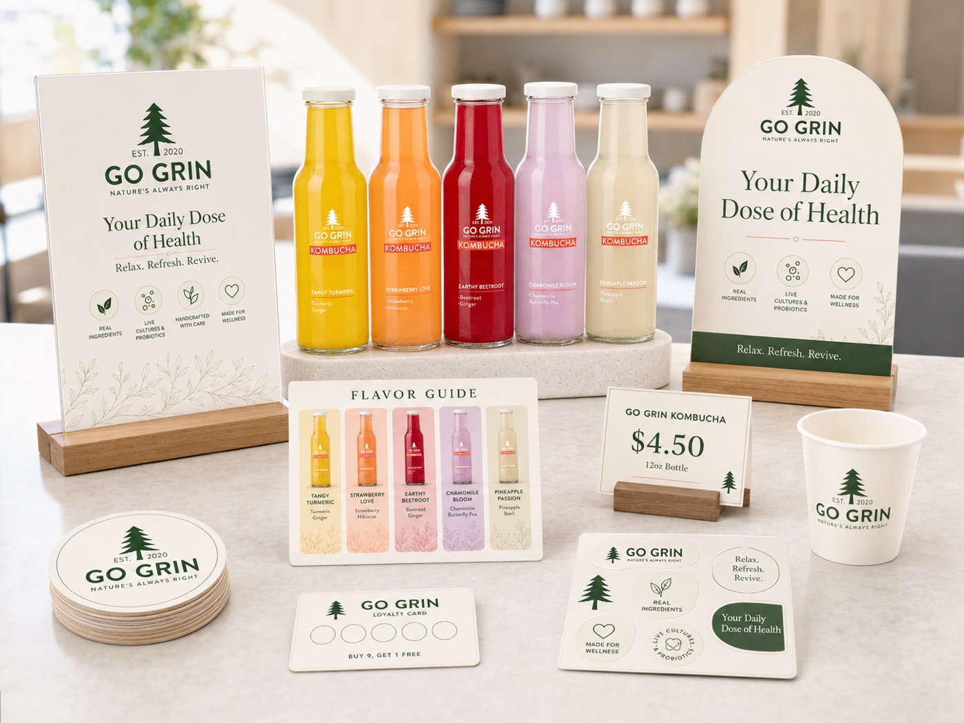
Forest green plus five flavour hues, Tangy Turmeric to Pineapple Passion, across labels, cartons and displays.
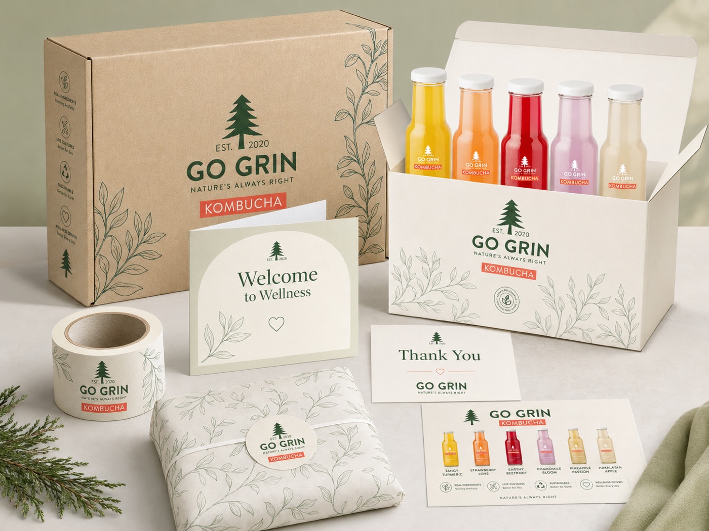
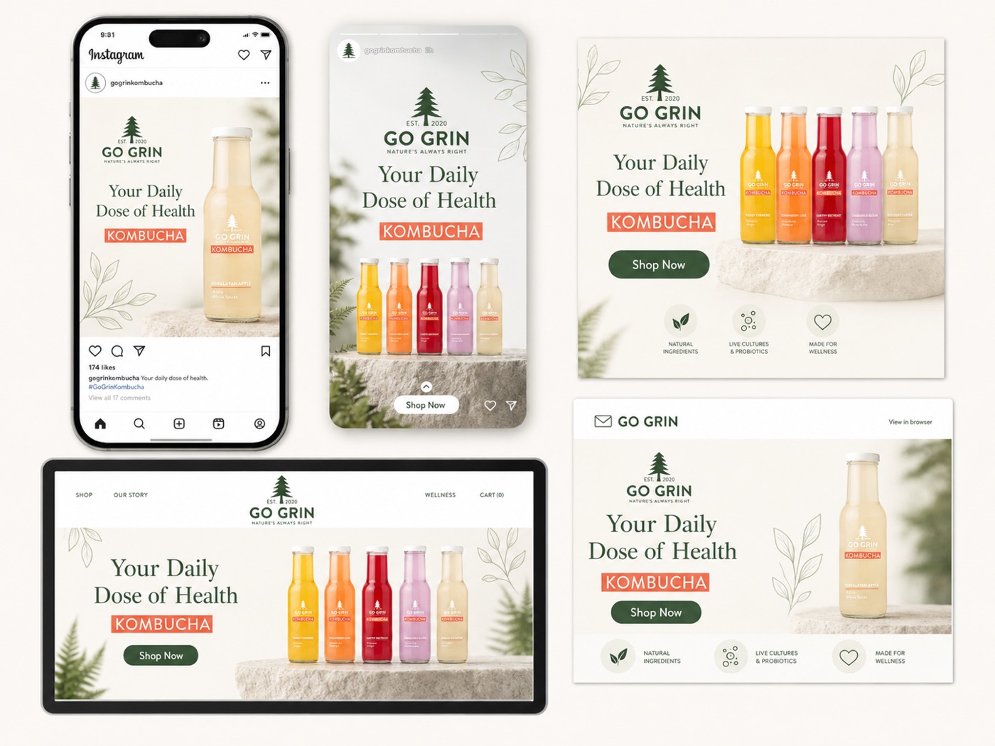
Brand identity, packaging system, retail and café POSM, delivery experience, merchandise and digital marketing kit.
Bottle, chiller, café counter, courier box, feed and inbox: one language everywhere.
The mark: one pine, est. 2020
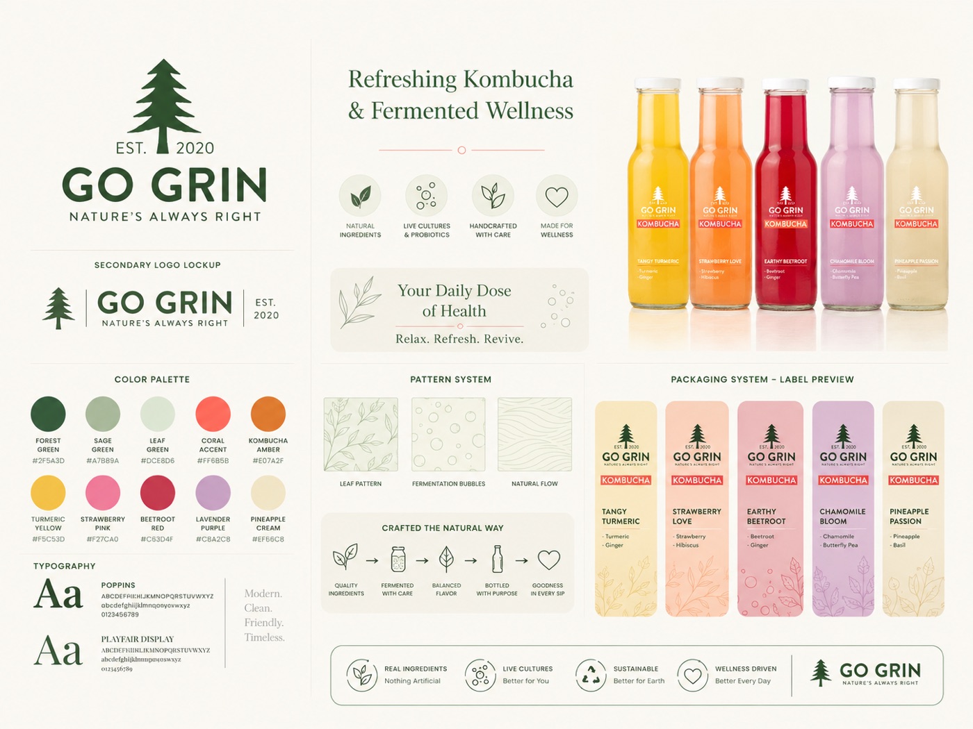
The identity system: forest green, five flavour hues, leaf & fermentation patterns, Poppins × Playfair
The brand, on shelf and in hand
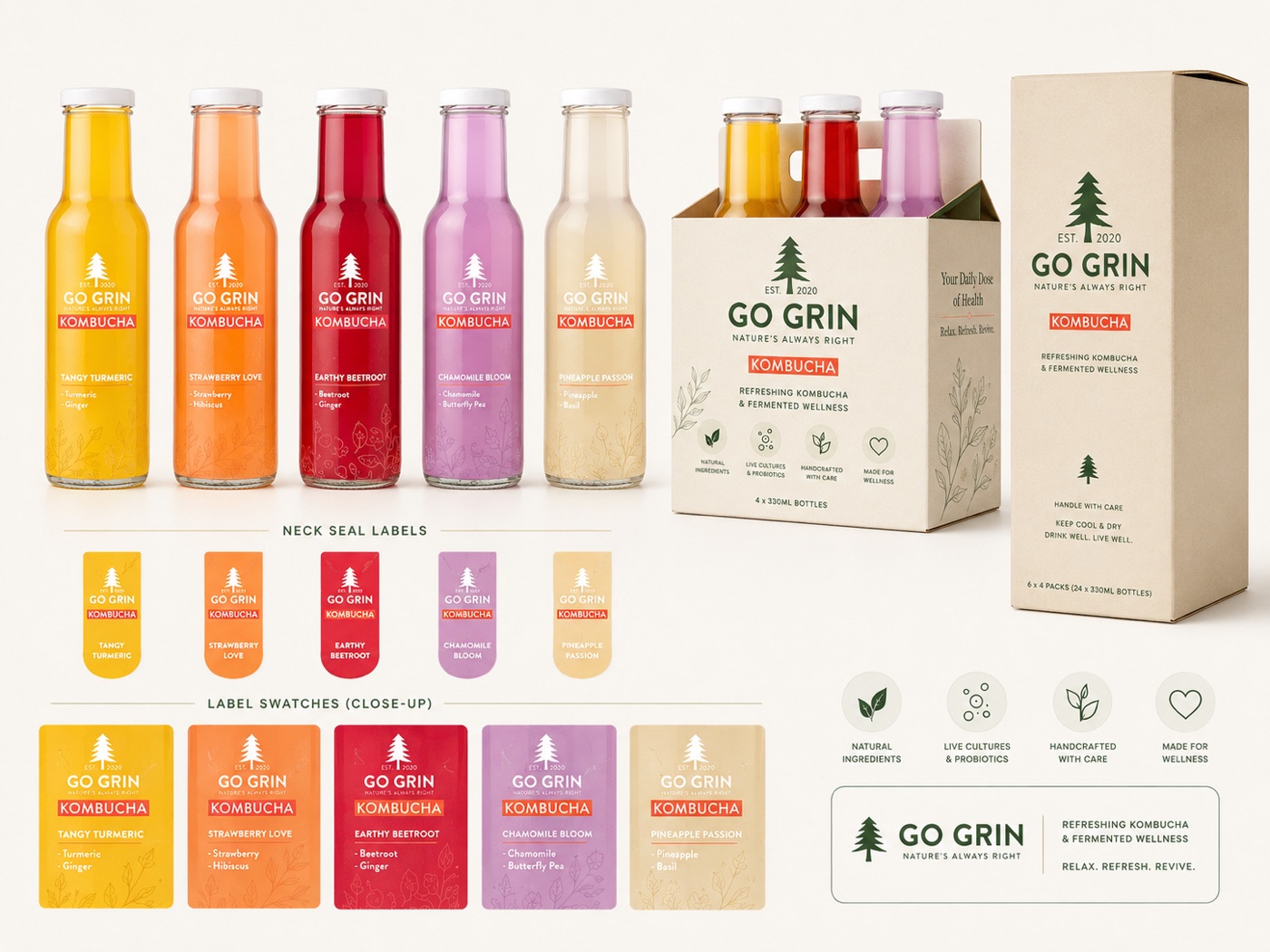
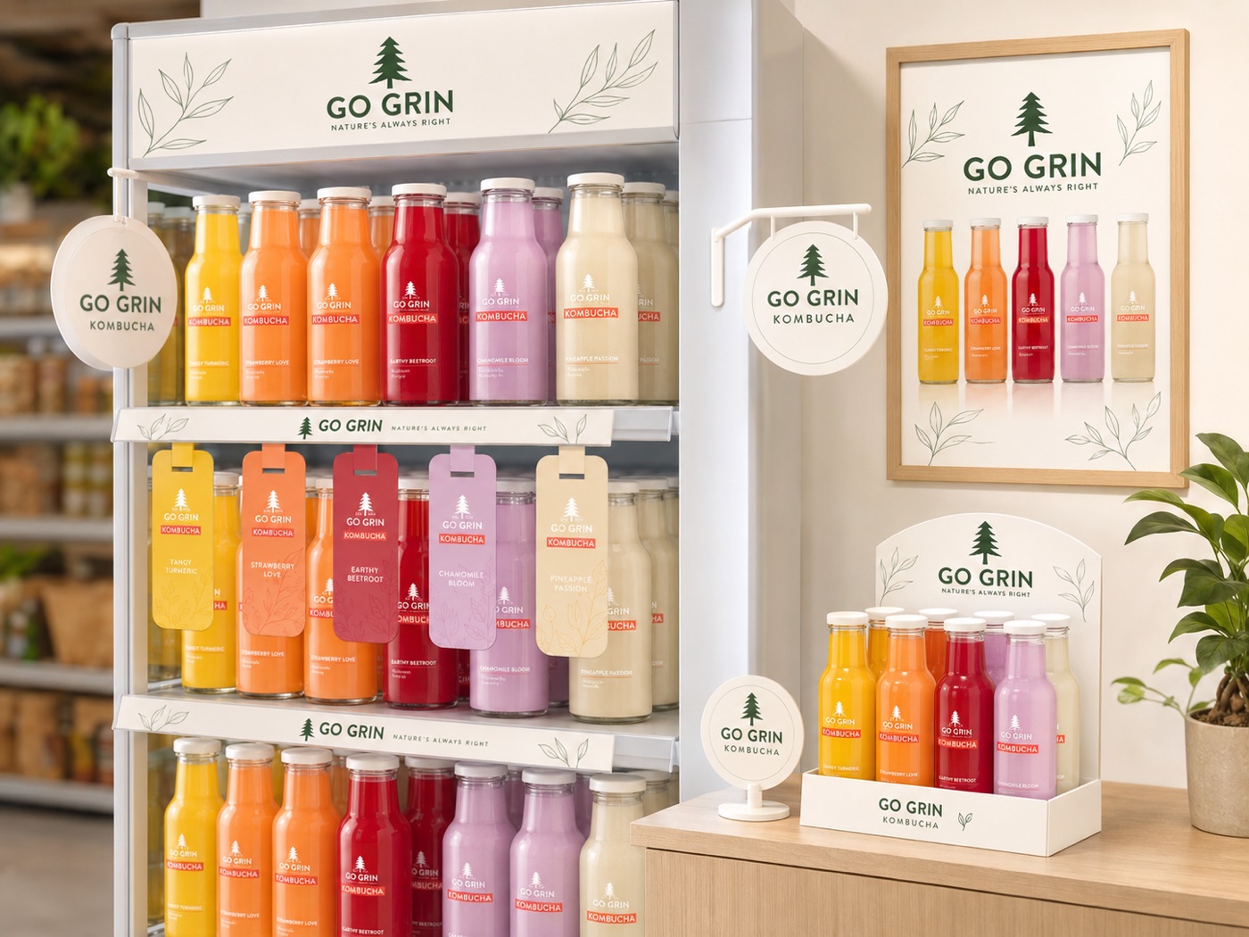
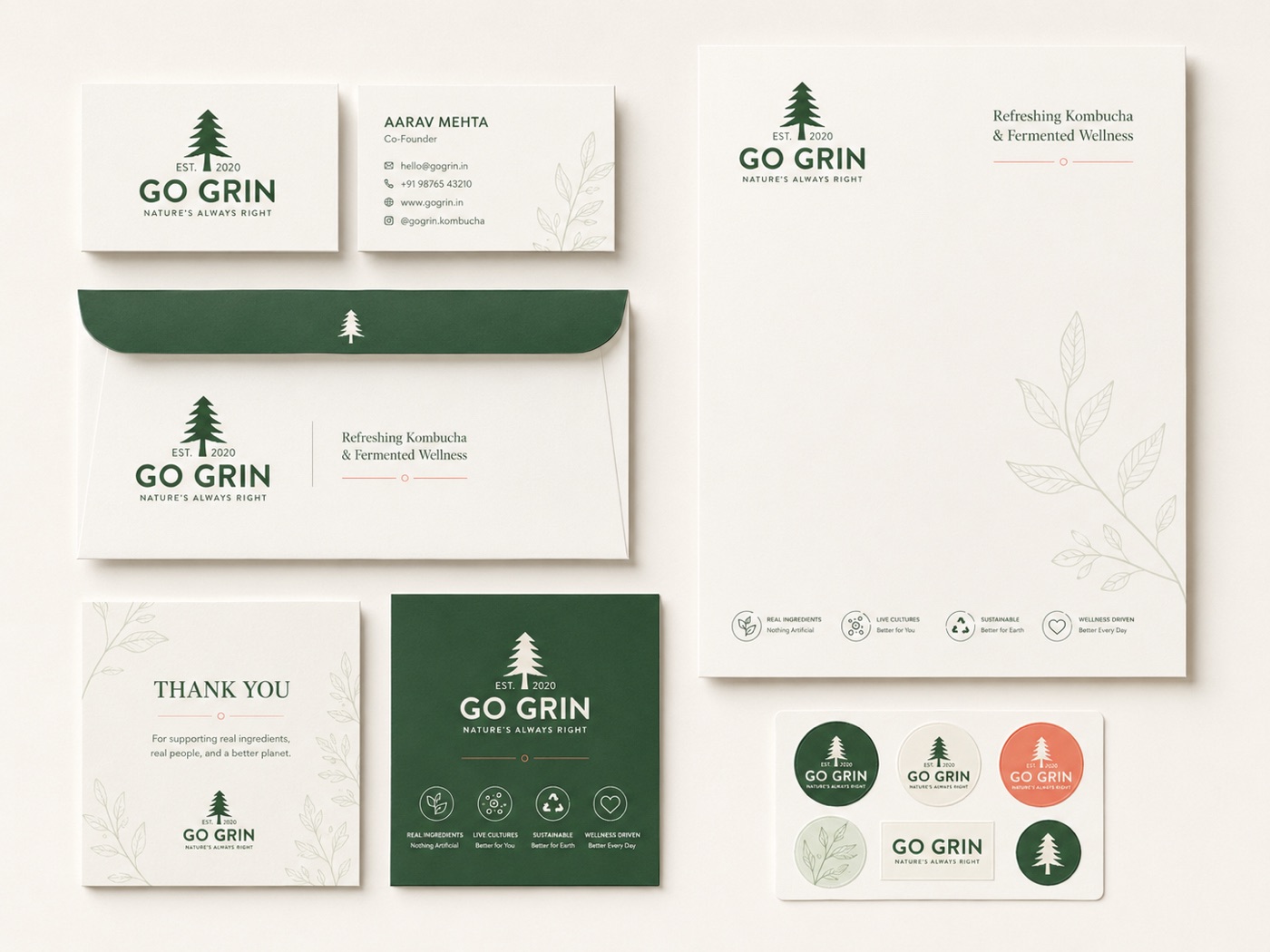
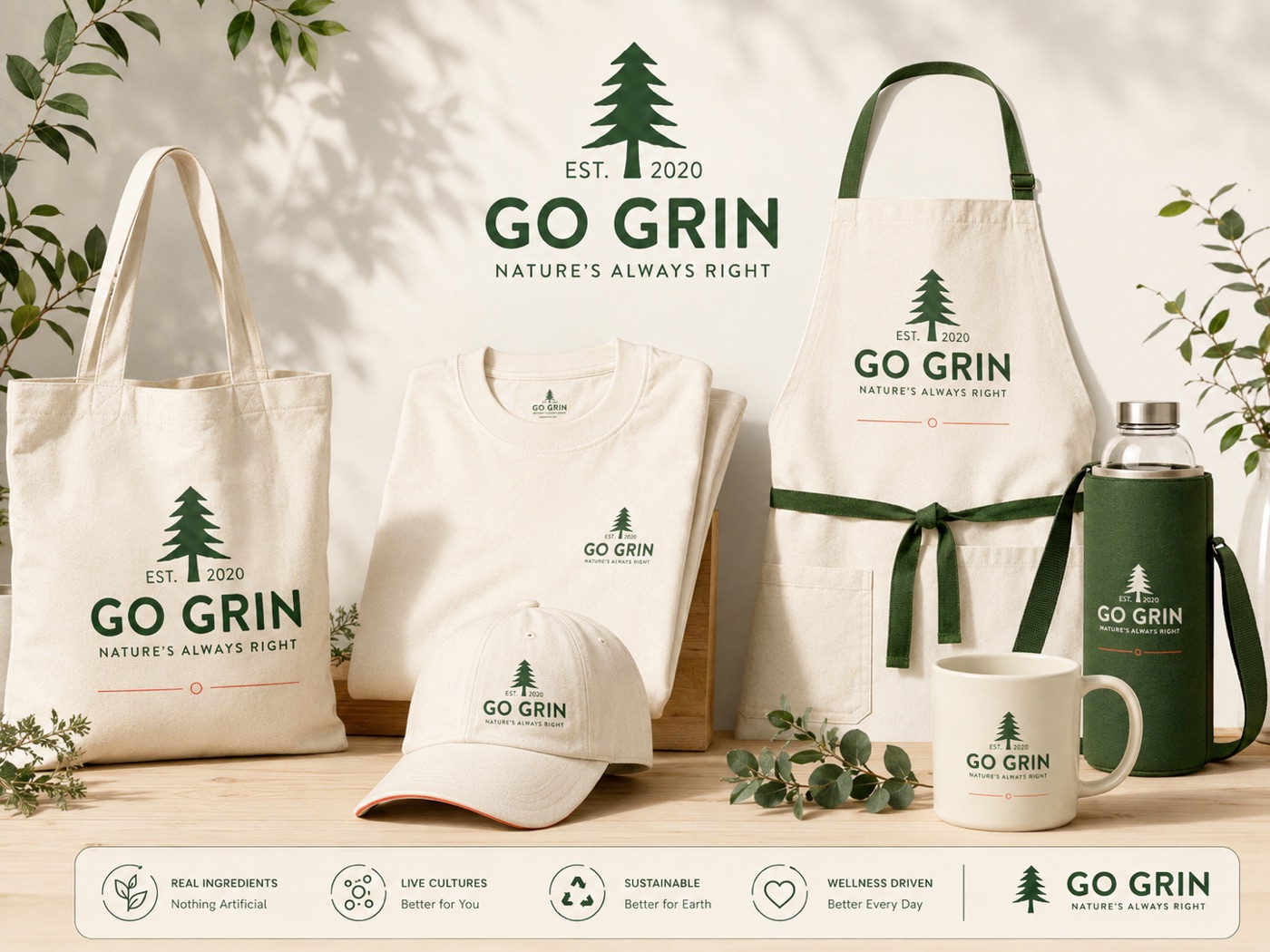
The identity, in application
The same calm system at business, merchandise and digital scale. Tap to enlarge.
"Health is an argument. A grin is a feeling. The brand was built so the healthier choice would also feel like the friendlier one."
Strategic insight · 06The practice behind this: Brand Strategy & Identity · Digital & Social Systems